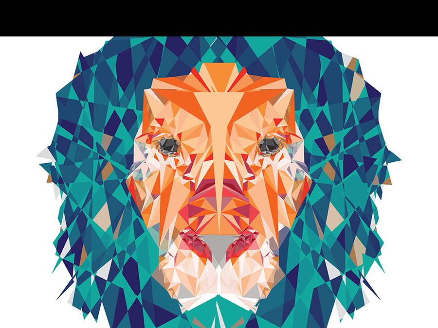
The first image I chose was from the Florence Institution of Design International. I picked this image because it reminded me of some of the tasks we have done on photoshop and illustrator. The creator of this uses, it looks as if, one shape to create the whole tiger, triangles. The artist also creates a contrast between all of the colors of the triangles in order for us to clearly see all of them but spacing them close enough together that there is no empty space. This reminded me of when I had to make a cat using only shapes and it was very hard to do. I can appreciate and admire how tedious and how much dedication and time this must have taken the artist.
https://www.florence-institute.com/Summer_Digital_illustration_Courses.html#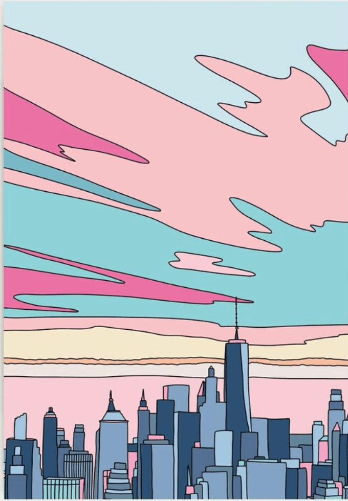
The next photo I found which I think is considered a digital design is, City sunset by Elebea
Designed by, Sabrina Brugmann. I chose this photo because of the colors she uses to contrast what looks as if a city sunset. The different colors also allow you to see the intricate pattern that Braugmann decided to use. Furthermore, she even included some of the buildings to be the color or the sunset, which took me a second to even notice. Brugmann even made parts of the buildings to be different shades of grey, making them look 3-D. To portray the population of the city Braugmann put the buildings clustered, with little to no proximity between them, making me think that this could be NYC, Chicago, Miami, etc.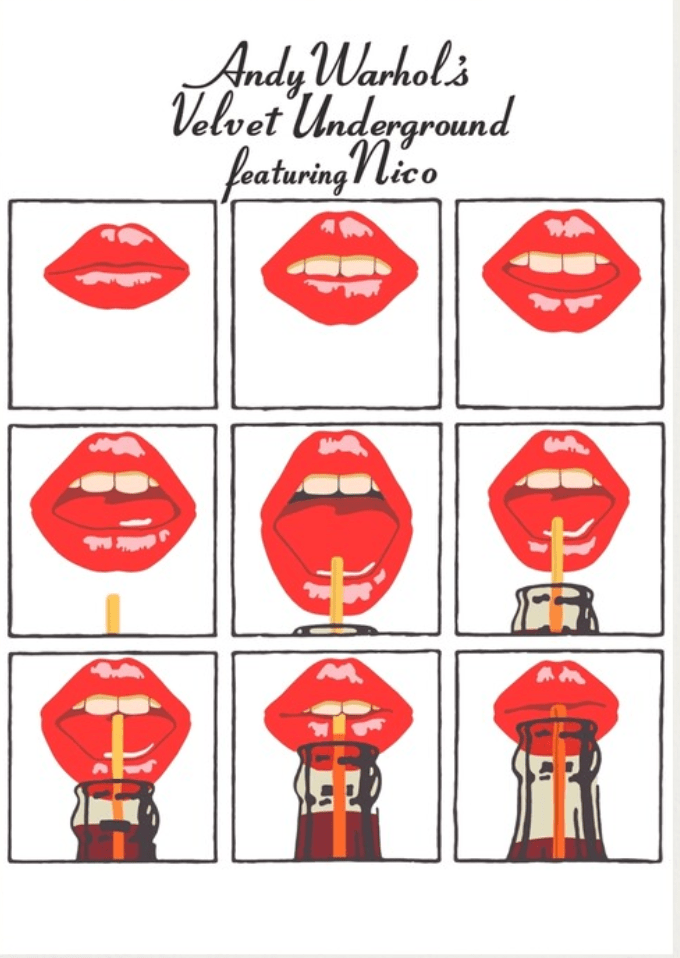
The last is Andy Warhols Velvet underground, I chose this one which is a well known classic because, I love this digital design. I have it hanging in my dorm room, where I cant get it from until May 31st lol. I love how the design uses repetition in order to appeal to the eye. The photos start with the mouth closed and each one gets wider until she sips her soda. This design tells a story that is easy to read, and while it is using repetition, of the mouths, none of them are the exact same, some similar. In addition, the boxes are placed to create the same amount of space on both sides. The top and bottom are not the exact same but leave little white space. The photo all in all though does have a lot of white space. This allows contrast which I think makes the design pop.
- Comment
- Reblog
-
Subscribe
Subscribed
Already have a WordPress.com account? Log in now.
